BOOK COVER DESIGN
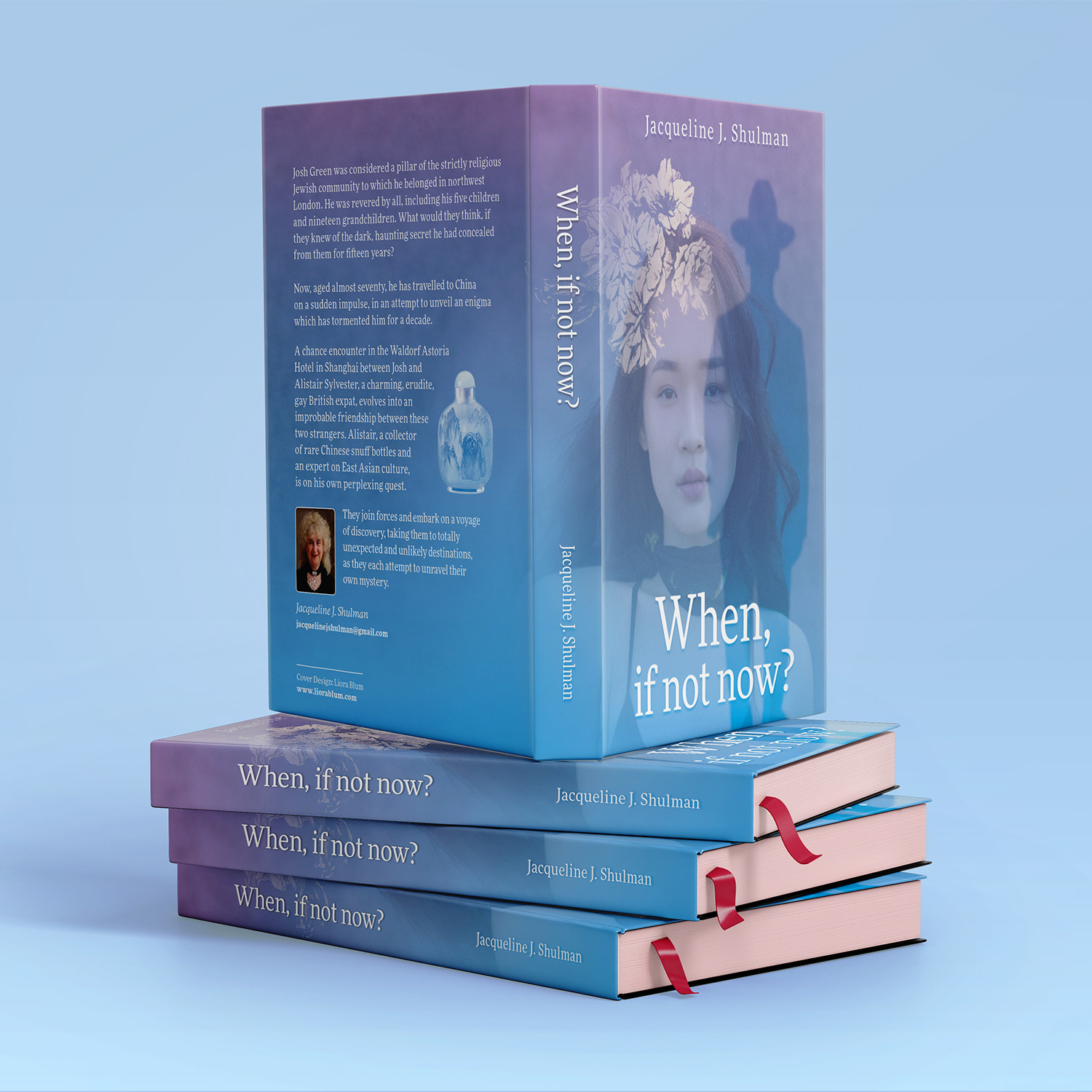
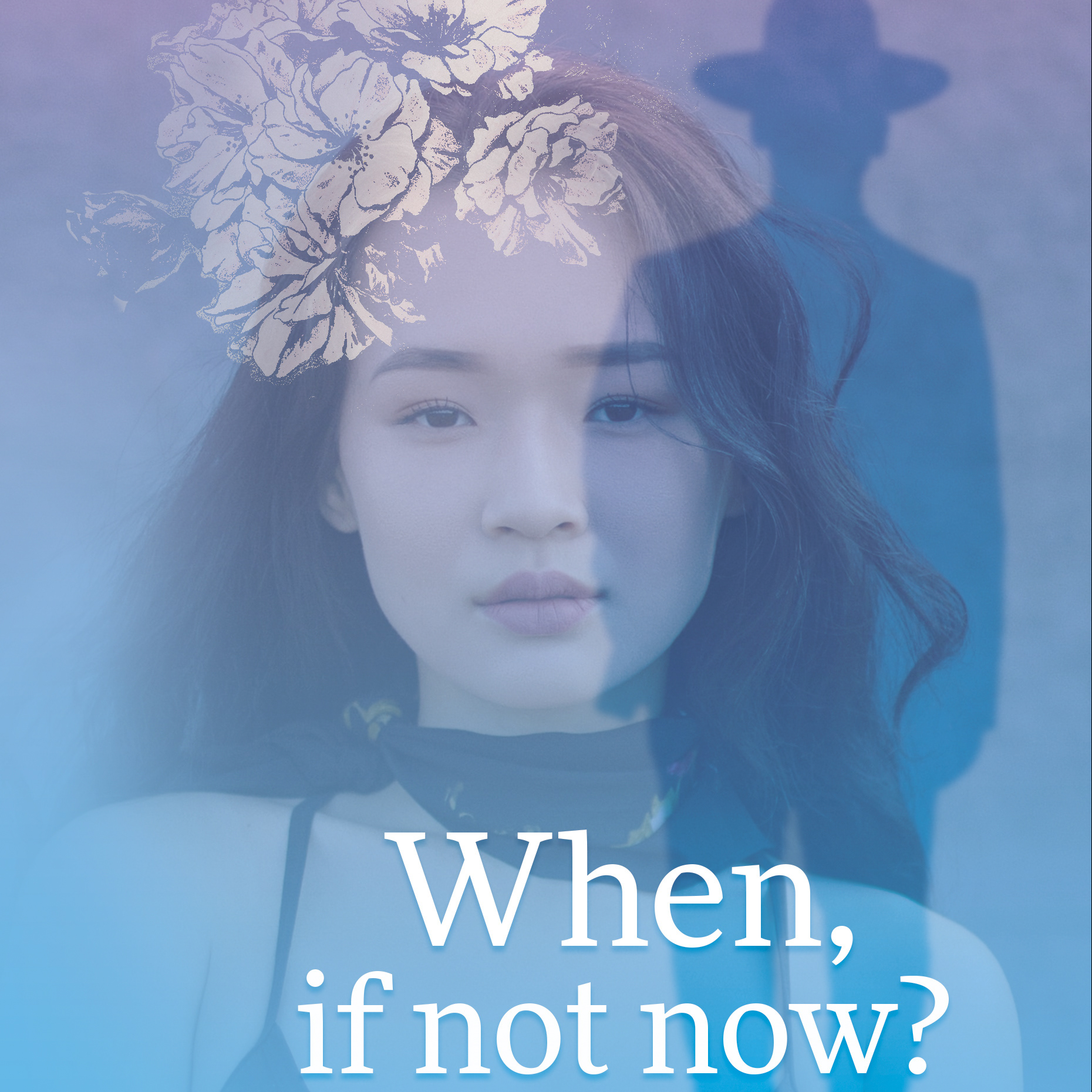
Recently, I had the opportunity to design a book cover! In the novel, a married man travels to China to find his lover who has curiously disappeared. The misty purples and blues reflect a sense of mystery.
GOLDY TLV
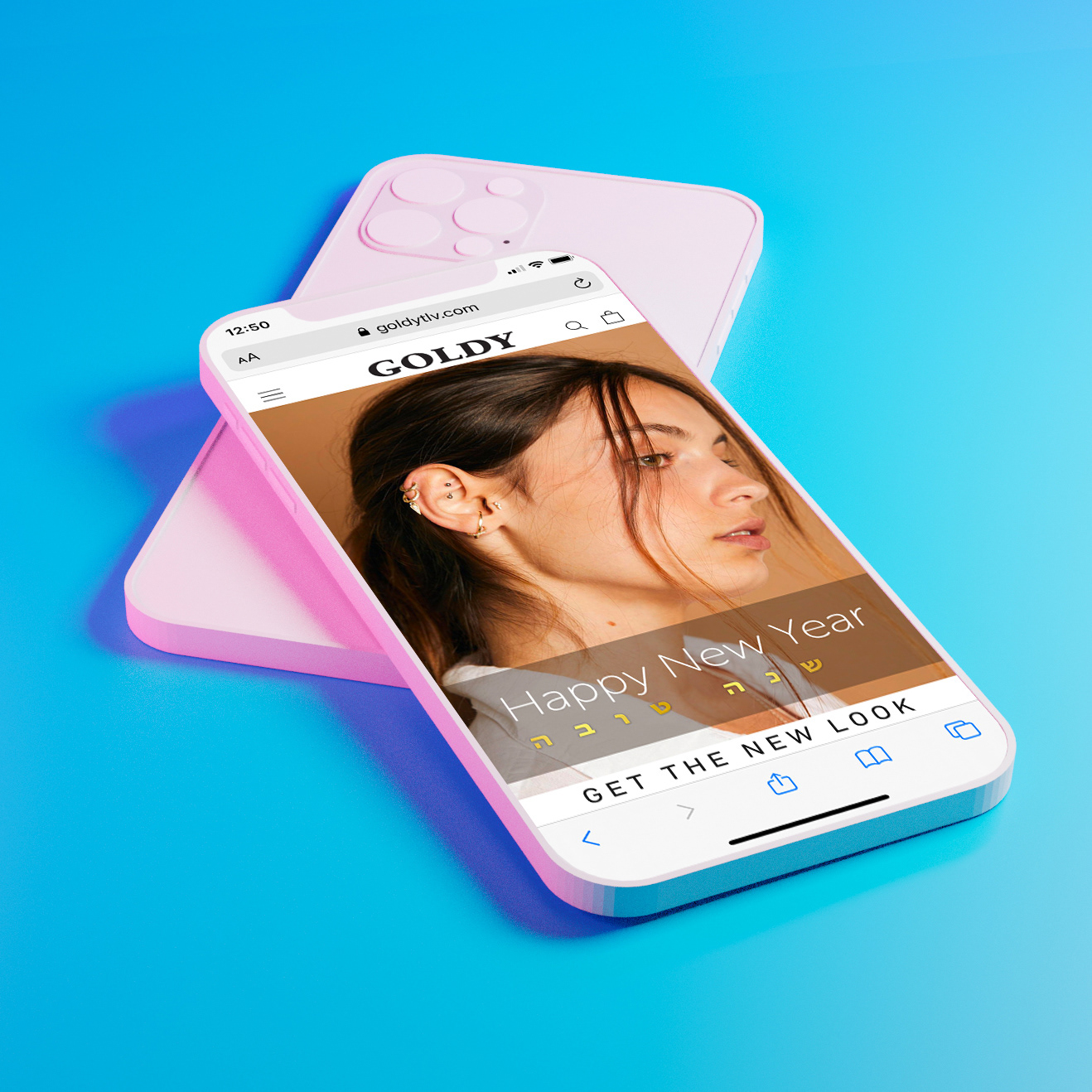
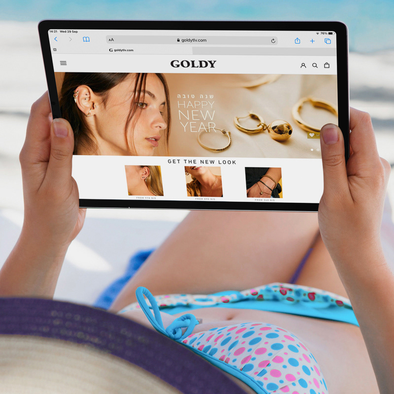

I worked with this upscale Tel Aviv jewelery retailer to create social media campaigns for their Jewish New Year and Black Friday sales.
IGRA NEWSLETTERS
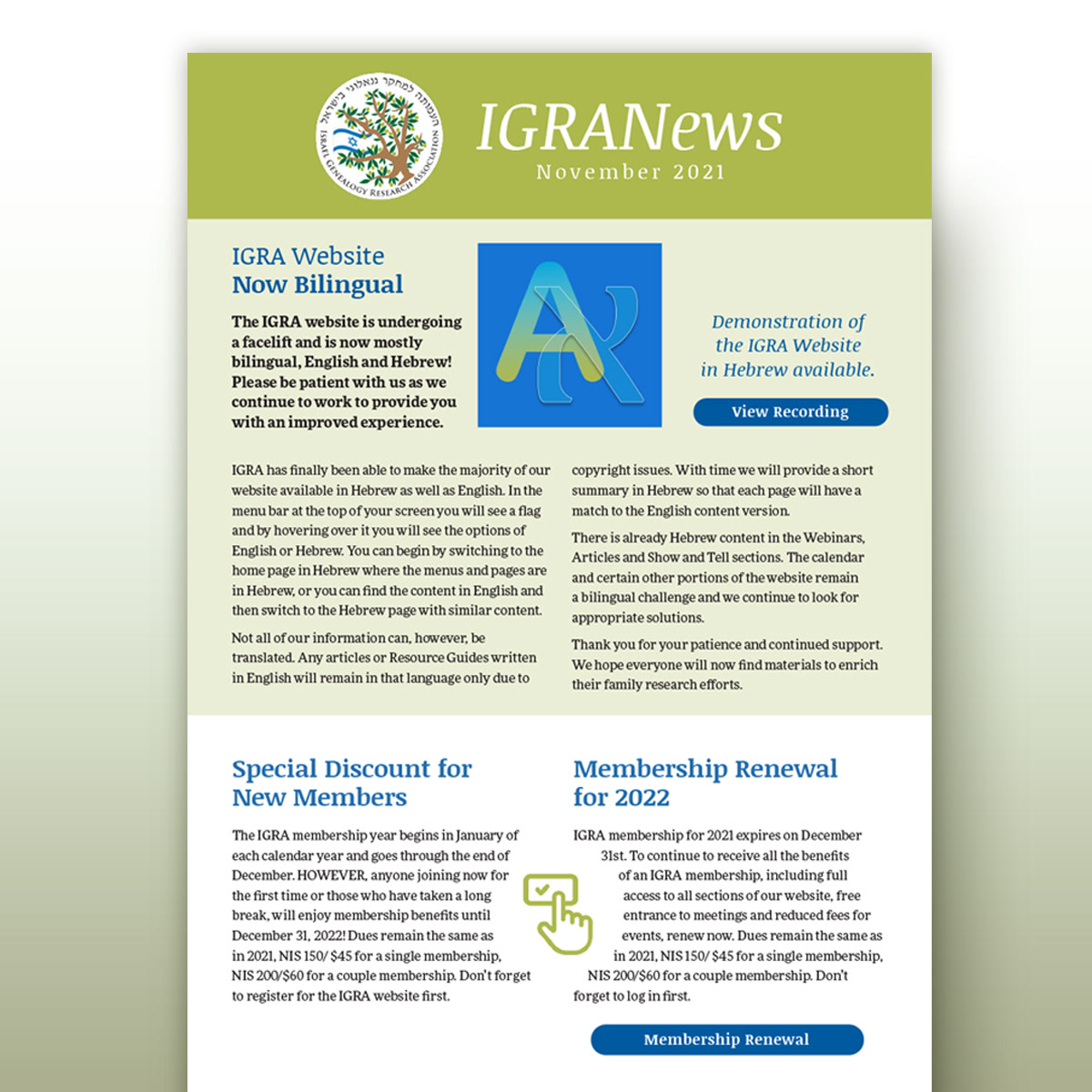
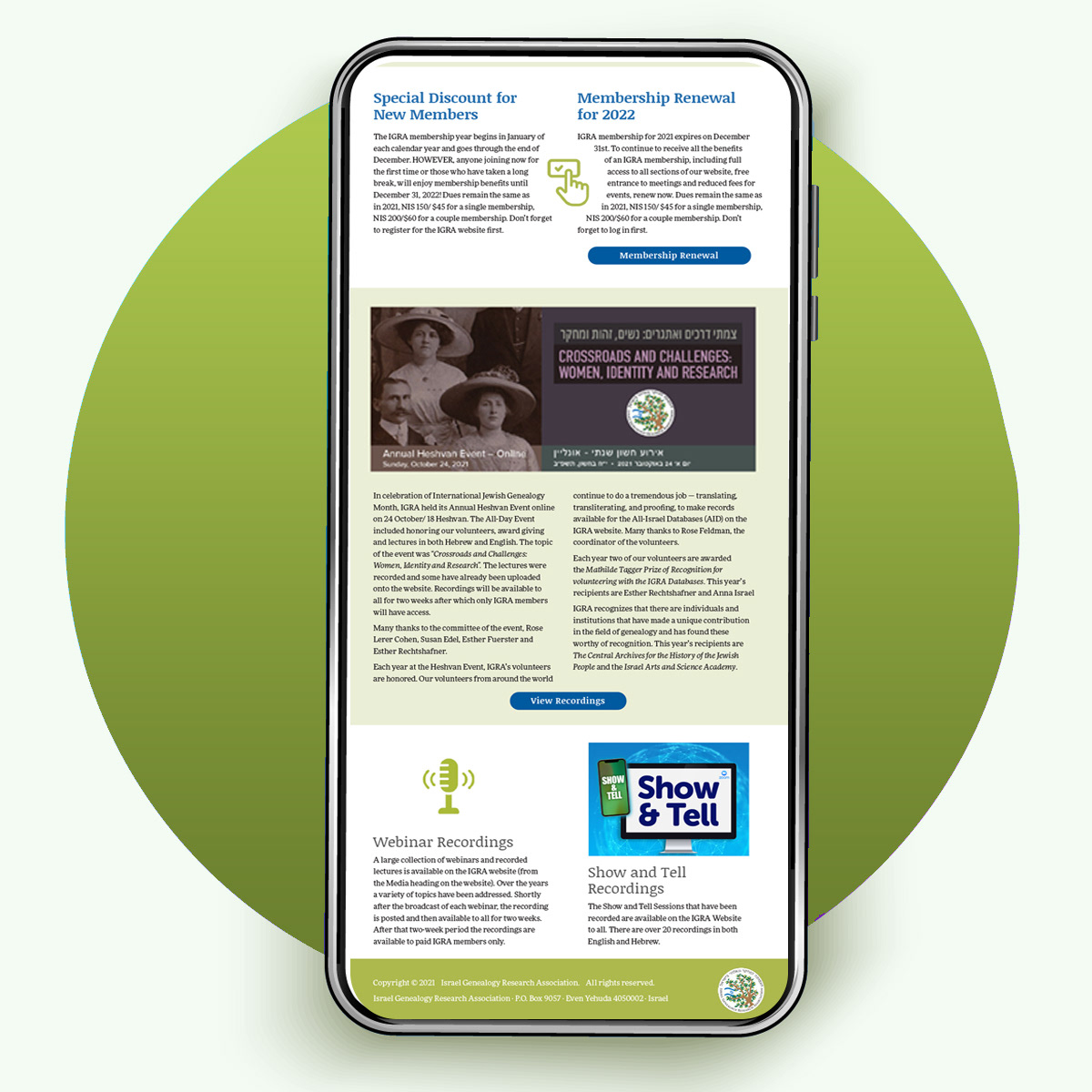

Every event in the IGRA calendar is announced in the newsletter, which is sent around the world to subscribers. I like the challenge of creating a clean piece of reading material when there are loads of different elements to include.
Case Study: ESRA Magazine
What were the challenges that ESRA was facing when they approached me to redesign the magazine?
The ESRA Magazine is a much-loved quarterly publication that serves Israel's large English-speaking community – a spirited bunch with many volunteers who aim to close cultural gaps in society, and also to meet for social events and activities. I was approached to redesign the magazine from Issue 206.
ESRA had been using the same layout for ten years and the magazine looked dated. However, many of the readers are elderly and have trouble reading small text, so the type had to remain large, with jumbo-size photos. On the inside pages, text and titles packed each spread from edge to edge, making it feel cramped and stuffy.
What challenges did I face with the redesign?
My goal for any design is to spark interest and to call viewers to action. I want the cover to attract viewers and trigger them to open the magazine. The inside pages should draw readers in and keep them engaged. I also wanted to create a harmonious color scheme and reach out to readers with alluring typography
What design tools did I use to deal with these restrictions?
With a large font size plus huge images, I had to find a way to fit everything in. I did this by combining a few design solutions:
• White space keeps a page looking minimalistic and elegant for a clean appearance.
A grid was designed to hold the titles and text firmly in place, yet ensure that additional elements such as callouts and photos can be added on the page.
• Typesetting ensures a quality reading experience. I advised with a print expert, tested multiple variations of tracking (space between letters) and leading (space between lines), and made sure that the text would be clearly legible, even for the sight-impaired.
Left-aligned text makes an easy reading flow, and custom typesetting minimalises the right indents of the text blocks.
• A strong grid system is at the base of every publication. It balances all the elements to form an attractive composition that will be dynamic and never boring.
By defining where columns and gutters, margins and borders begin and end, one can arrange the essential items (titles, headers, body text and images) in an aesthetic, balanced way.
Branding and Page Template: Three elements are necessary on every page of the magazine: section titles, the magazine name and page number.
All branding elements are along the outer edges, so the page looks longer and more elegant.
What design decisions made the magazine a success?
I wanted to unify all future covers with the same layout plus subject matter that has a common theme running through all issues. As an art lover, I was happy to see that each issue featured an Israeli artist, so I suggested that each cover would be graced with a full-sized photo of a work of art. Putting all the issues together, we can enjoy a mini exhibition of the Israeli artscape!
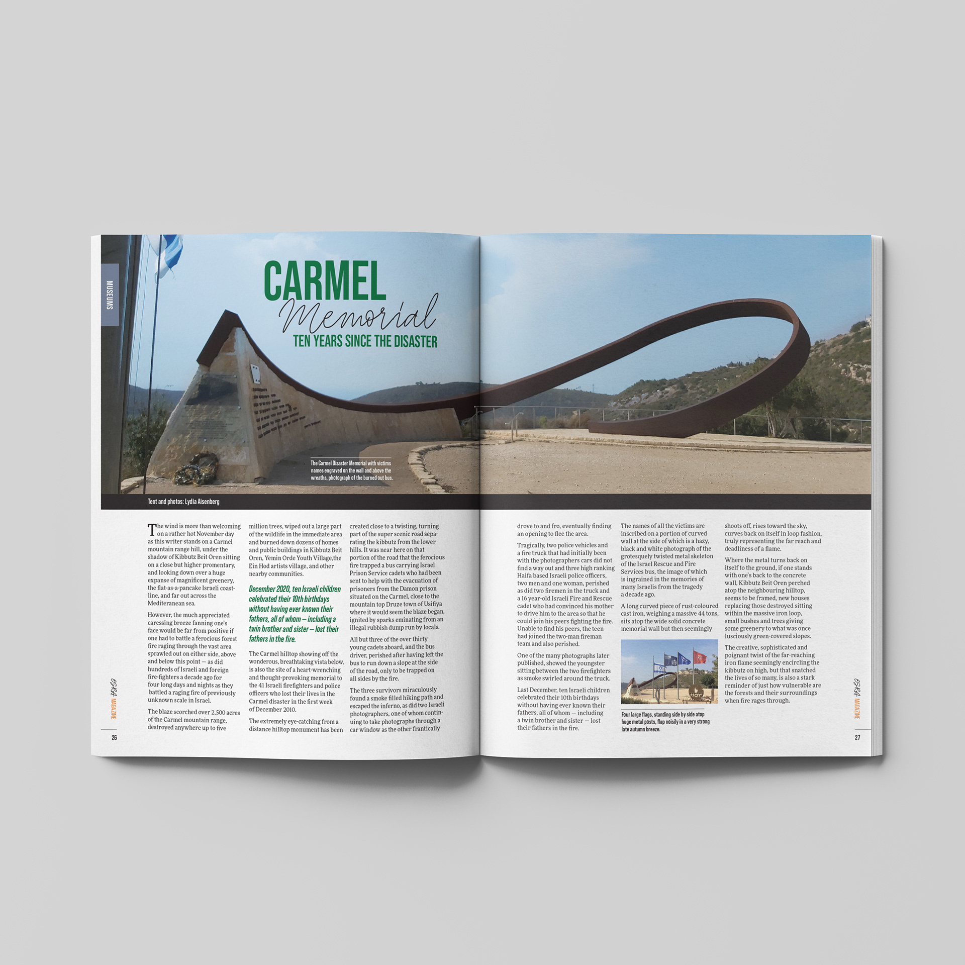
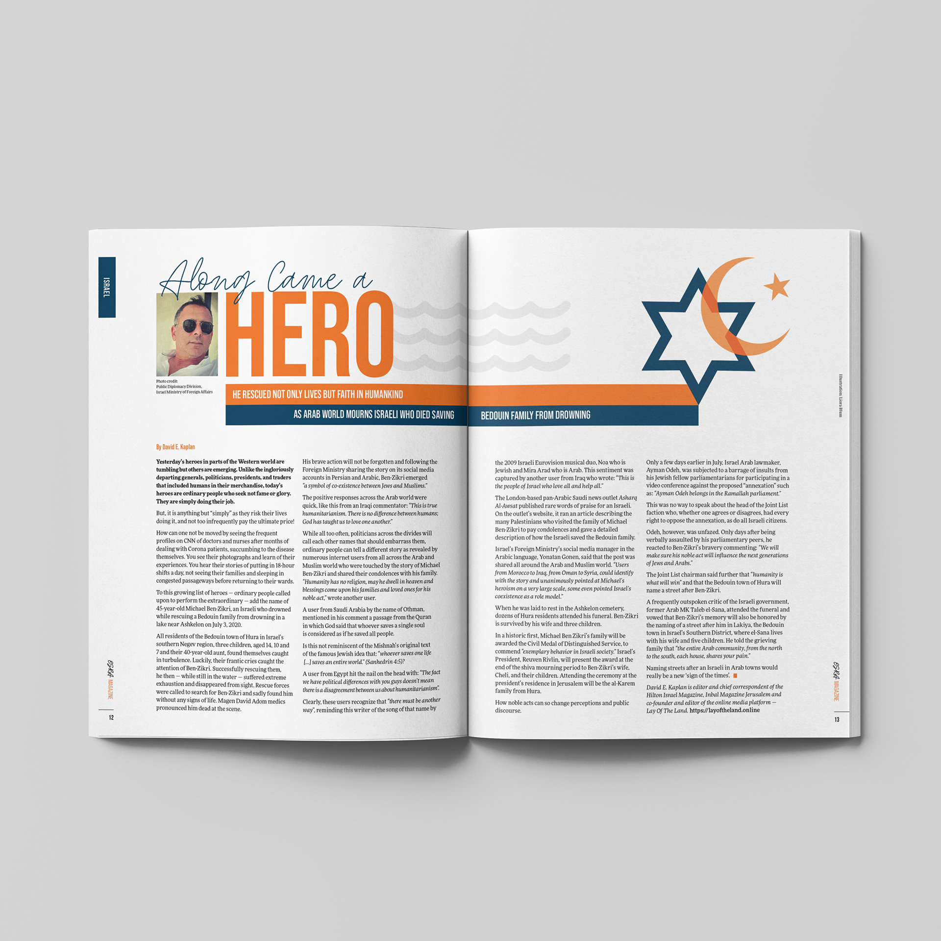
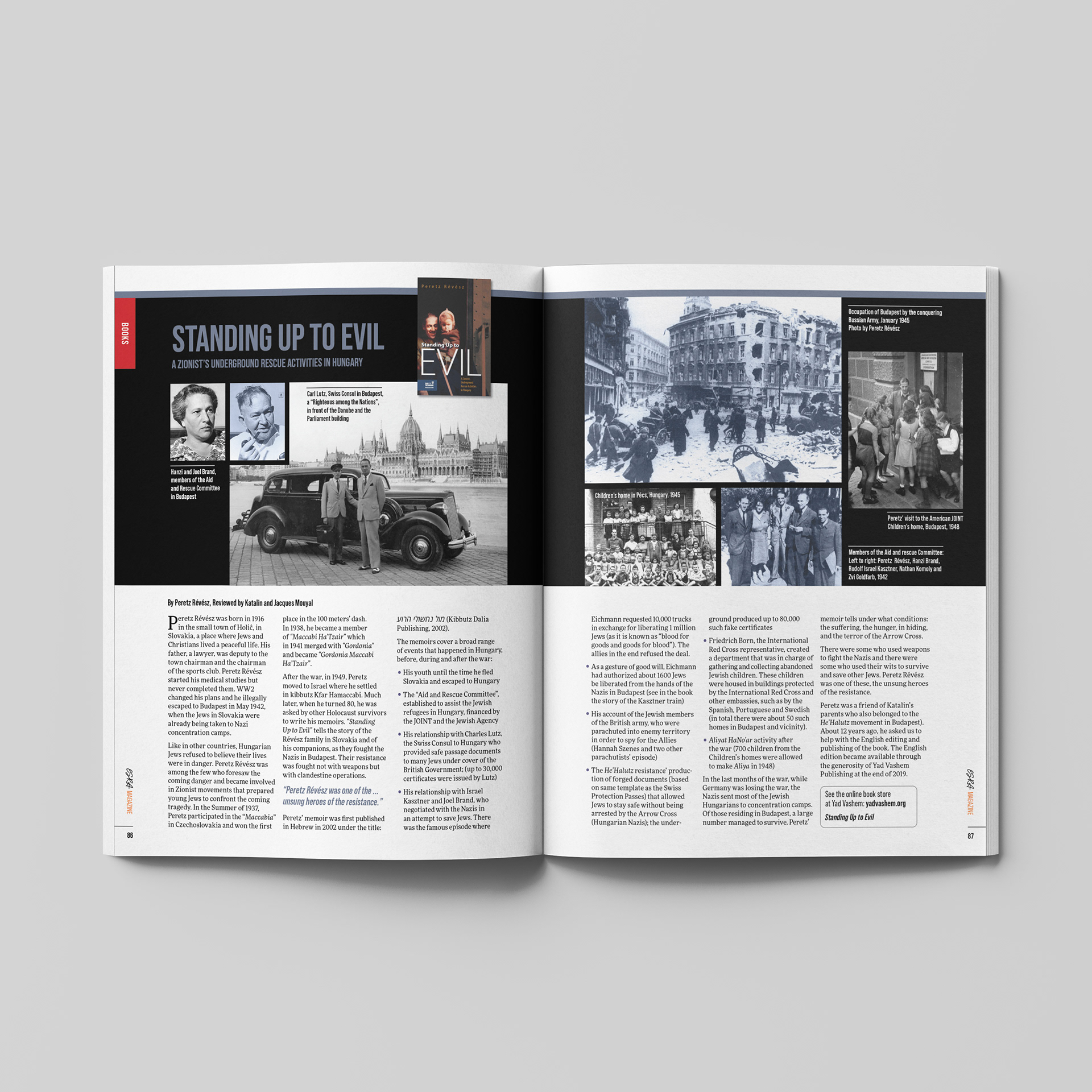
Page titles include a combination of two fonts – a bold, condensed sans-serif font together with a flowing, hand-written typeface. This symbolizes the nature of ESRA Magazine: strong and practical, with a human touch.
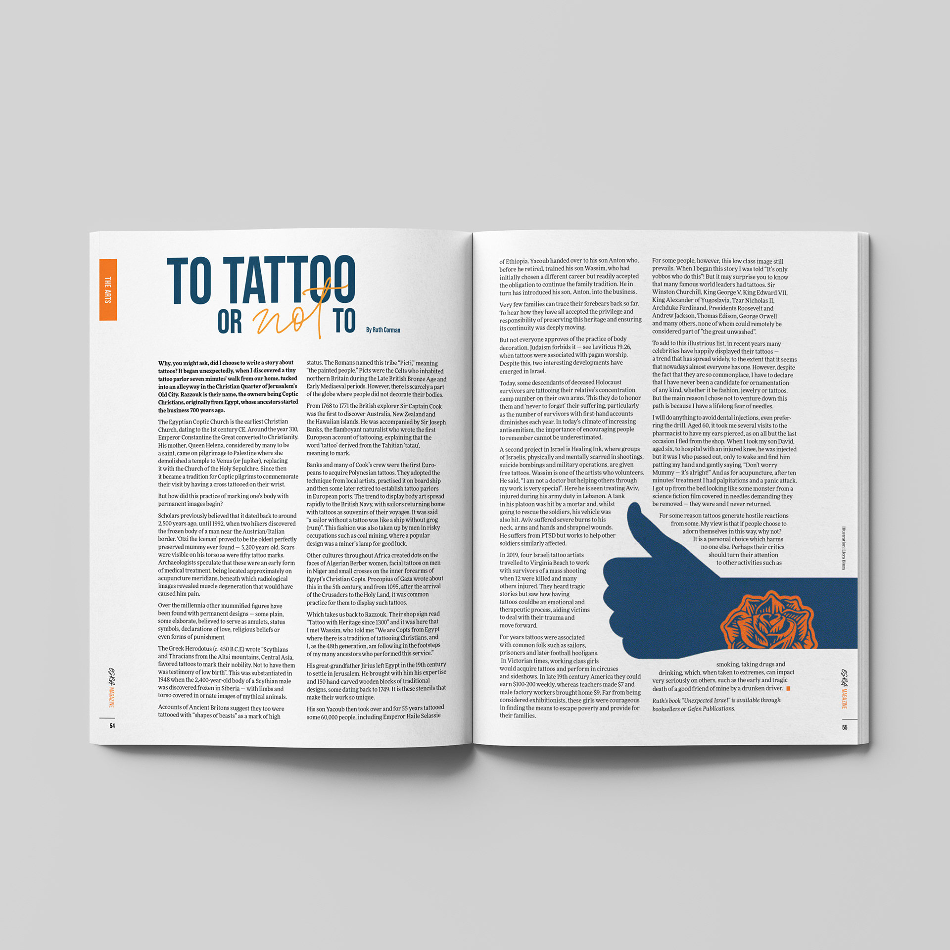
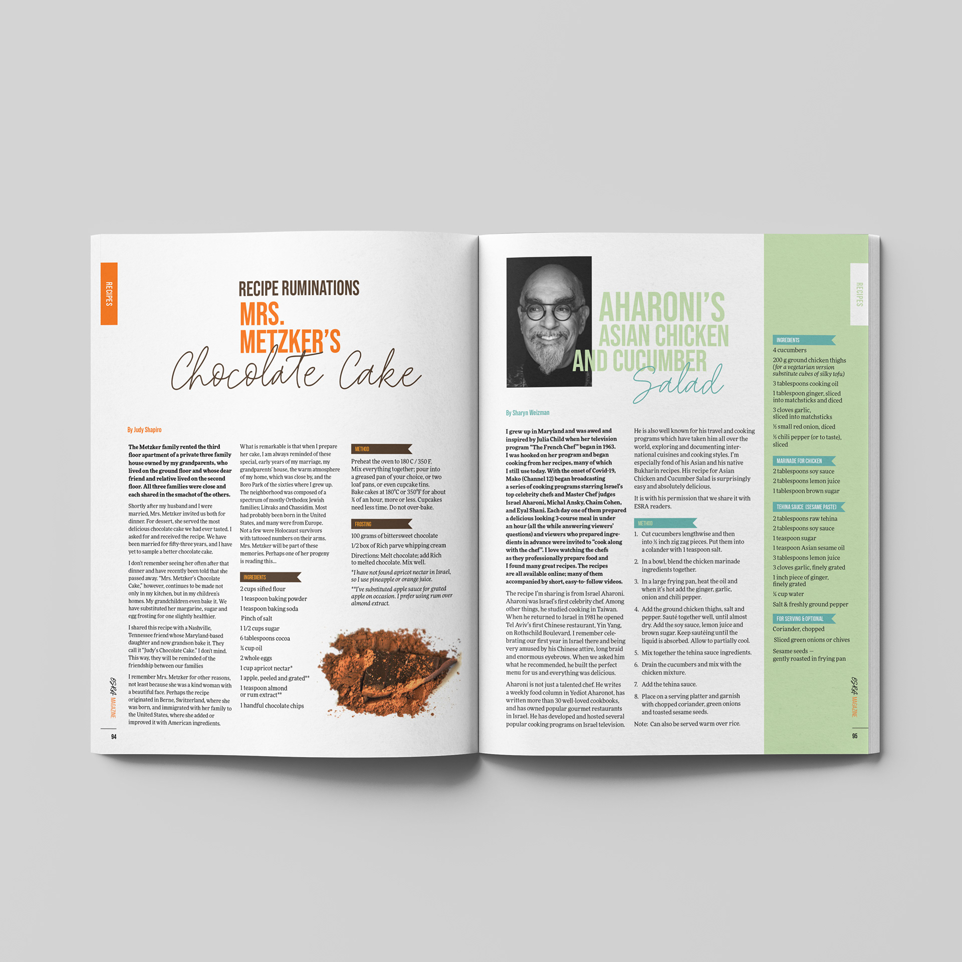
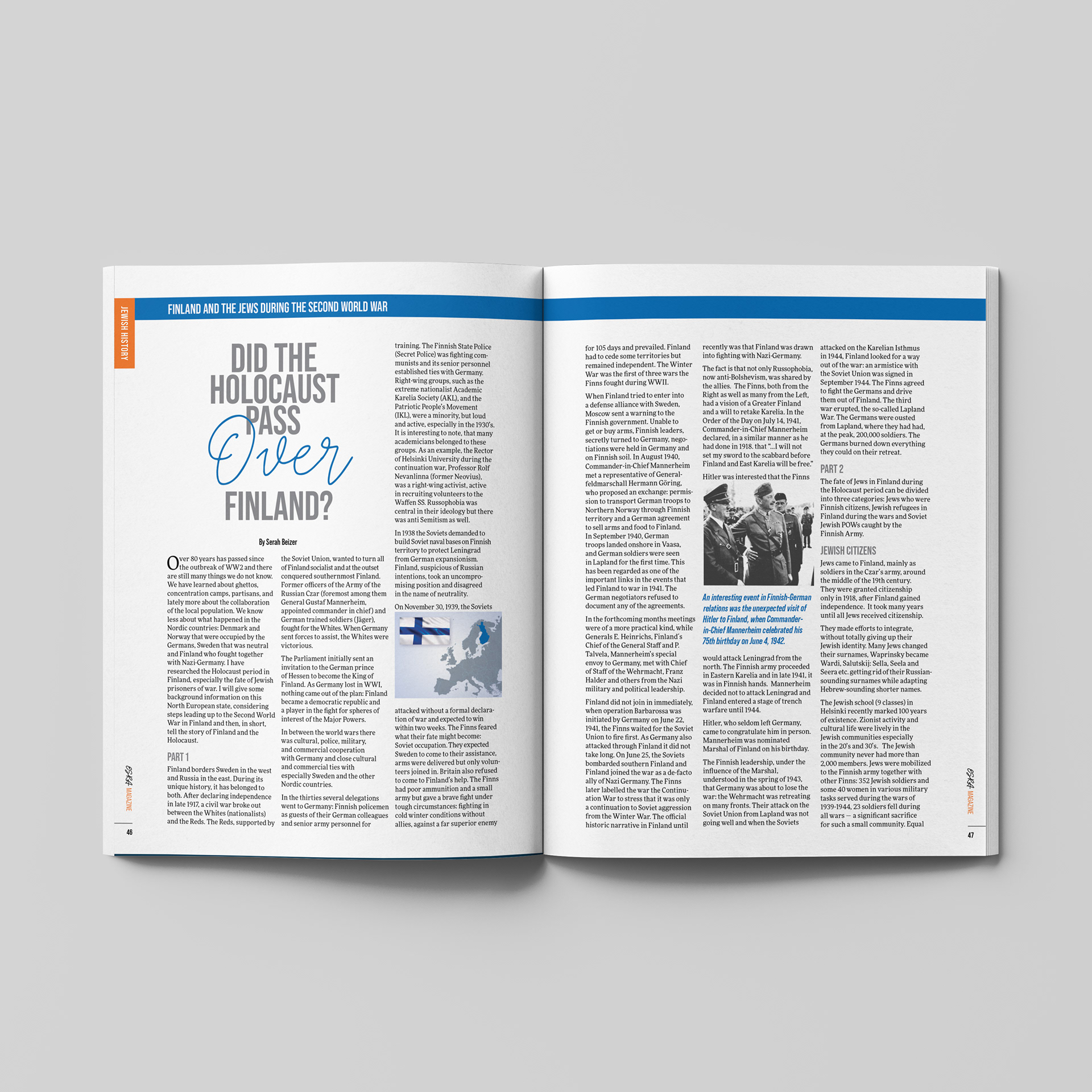
Images can span double spreads for maximum visual impact. The success of the spreads relies on a combination of typography, grid and photography. Colorful callouts are another typographical element that break up the monotony of a text block and draw readers in. A bright color palette creates a modern, vibrant feel.
5 Graphic Design Tips for Marketers
Instagram and Pinterest should be a paradise for us visually-driven beings. These platforms are made for the image to take center stage, with hashtags and captions trailing behind. And while many big companies have drool-worthy pages, some disappointingly let their brand down. So here are my tips for the latter.
1. Don’t overlook visual planning
I know you want to get your product/service on as many social media platforms as possible but take the time to see that there is a uniform visual language on all your pages. Ex: If your company colors are pink and orange, see that this is used throughout.
2. Pay attention to the quality of images you use
Remember, the visuals are what largely attracts your prospects on social media so use pixel-perfect, gorgeous images.
3. Stick to a maximum of 2 fonts in a posting
Too many fonts compete for attention and can even land up overshadowing content.
4. See that your content is easy to read
Sometimes when text of a certain color is placed over another solid color, it becomes difficult to decipher and the viewer will just move on as it’s too much of a strain.
5. Don’t confuse your viewer with photographs and visuals which aren’t aligned with the message of your company
If you are selling a relaxing, new-age experience then make sure that the tones reflect that.
Go ahead and follow these tips to create, grow and nurture your brand on social media – as you would in any other format.
