Logo for Shurat HaDin – Israel Law Center
Dynamic Brushes, www.dynamicbrushes.com
Logo design for Nativ, a Taiwan-based investment management company.
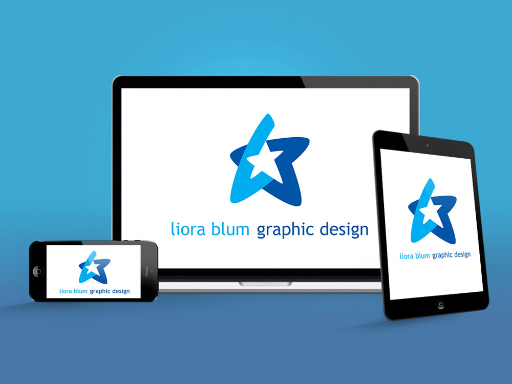
Logo and Self Promotion

Zaikai Goldstein Photography
Logo for Oz Solomon Patent Attorney
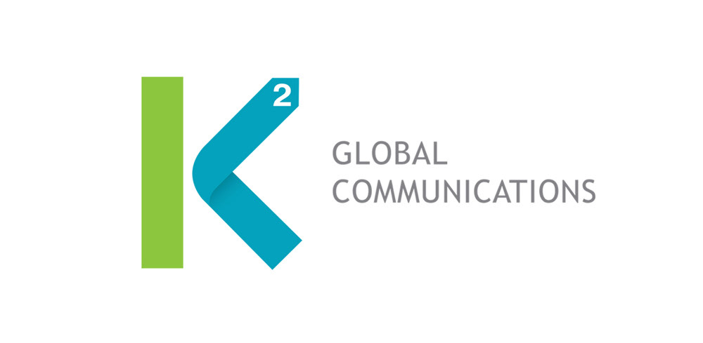
Logo for K2 Global Communications
Below is the design process for the K2 logo:
The owners of K2 Global Communications approached me to create their logo and branding. They wanted a logo that would be dynamic, show direction and include the K2. Also, the logo should withstand the test of time and work just as well in the future as it does today.
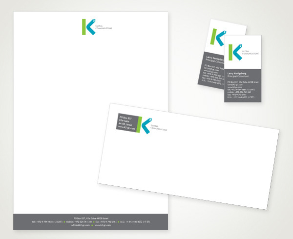
K2 Global Communications is a boutique marketing, communications and public relations firm. I was approached by the owners, Larry and Amy, to create a logo that would show direction, be dynamic and stand the test of time – that is, not a fad design to be replaced within a few years. Here’s the printed collateral which is hot off the press. I’m really pleased with this logo and branding because it looks appealing and says everything about the company that we set out to say.
The cleaner the logo, the easier it appears to have been conceived. Of course, nothing could be further from the truth. I’m going to walk you through the stages it took for this logo to be created.
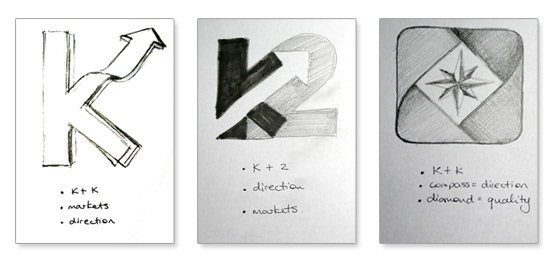
At our first meeting, I asked Larry and Amy for a list of words that the logo should embody. They drew up a list of 8 words, and I then asked them to identify the 3 words that best describe their The cleaner the logo, the easier it appears to have been conceived. Of course, nothing could be further from the truth. I’m going to walk you through the stages it took for this logo to be created.

Stage one of the logo design included 3 concepts which I presented to my clients. It’s important for the sketches to be just that: simple pencil sketches without any color or perfection. This helps the client to understand the concept without taking any of the options too “literally”. Although I know how many more steps lie ahead, the client may not be aware of this.
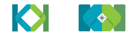
They chose the third option with the folded triangles representing the letter K, and the diamond/compass shape showing direction and quality. I began to put those shapes together on the mac and to loosely play around with the different forms. At this stage, the sketches should not be in color, which can cause bias by evoking various emotions.
.
When I showed Larry and Amy what I had come up with, they liked the two K’s that were made up of arrows. The logo was ready to add color, and I used turquoises and greens, which are cool shades but colorful.
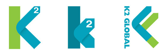
They were happy with this direction and so was I. The three key words were apparent, the letter K was taking shape, but when I envisioned the logo on a letterhead, the shape seemed rather lumpy and dull.
I decided to take a new direction and add 3 more options, which I don’t usually do (it tends to confuse clients). I simplified the logo by removing the diamond and the extra K. Instead, I used typography, which lightened it up and interacted better with the white space around it. Suddenly, the logo came to life – but now my clients were baffled: they had not one but three logos that they liked, and they didn’t know what to do. I suggested that they take their time and think about it, which they did.
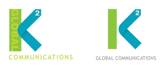
A few days later, they returned to me with a request to use the logo on the left but with text running down the side in white. I showed them some options, although the white text was detracting from the company name. I tried another version in a lighter green, which worked better, but the name still seemed difficult to read.
It became clear to me that the text should be removed from the side and that the two forms should be totally separated. The effect was like a breath of fresh air. The white space suddenly held the logo perfectly in place, and all that was left was to tweak the color and positioning of the text. The words “global communications” looked stale at the bottom, but when placed to the right of the K, it added a sense of balance as it emphasized the motion of the blue arrow.
The logo is now complete, Larry and Amy are really pleased with the outcome, and the branding of their updated website is already underway.

Jewish New Year card created for K2, using their colors to create a bright pomegranite, and designed keeping the look and feel of the logo in mind.